
教你用css绘制一个qq企鹅!
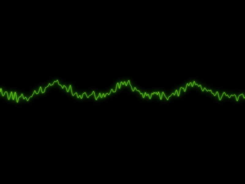
效果如下:
盒子身体部分代码如下:
对应的样式如下:
#wrap{
width: 116px;
height: 130px;
background: white;
margin: 100px auto;
border: 1px solid green;
position: relative;
}
#wrap .head{
width: 76px;
height: 60px;
background: black;
position: relative;
z-index: 3;
left: 19px;
top: 10px;
border-radius: 38px 38px 38px 38px / 45px 45px 10px 10px;
}
#wrap .eyes_left{
width: 13px;
height: 20px;
background: white;
position: absolute;
left: 20px;
top: 15px;
border-radius: 7px 3px 3px 7px / 10px 10px 10px 10px;
}
#wrap .pupil_left{
width: 8px;
height: 10px;
background: black;
position: absolute;
border-radius: 50%;
left: 4px;
top: 6px;
}
#wrap .eyes_right{
width: 13px;
height: 20px;
background: white;
position: absolute;
left: 45px;
top: 15px;
border-radius: 7px 3px 3px 7px / 10px 10px 10px 10px;
}
#wrap .pupil_right{
width: 10px;
height: 3px;
background: black;
position: absolute;
border-radius: 10px 5px 2px 5px / 10px 5px 2px 5px;
left: 1px;
top: 6px;
}
#wrap .mouth{
width: 44px;
height: 12px;
background: #F59F0E;
position: absolute;
left: 18px;
top: 40px;
border-radius: 20px 20px 30px 30px / 7px 7px 14px 14px;
}
#wrap .scarf{
width: 84px;
height: 22px;
background: red;
position: relative;
z-index: 2;
left: 16px;
border-radius: 10px 10px 40px 40px / 15px 15px 7px 7px;
}
#wrap .scarf:after{
content: ‘’;
width: 10px;
height: 10px;
background: red;
position: fixed;
left: 700px;
top: 182px;
}
#wrap .body_1{
width: 76px;
height: 60px;
background: black;
position: relative;
left: 19px;
z-index: 1;
margin-top: -20px;
border-radius: 0 0 38px 38px / 0 0 30px 30px;
}
#wrap .body_2{
width: 56px;
height: 45px;
background: white;
position: absolute;
left: 12px;
top: 10px;
border-radius: 0 0 28px 28px / 0 0 30px 30px;
}
#wrap .hands{
width: 12px;
height: 50px;
background: black;
position: absolute;
}
#wrap #hands_left{
transform: rotate(20deg);
left: 11px;
top: 60px;
border-radius: 6px / 25px;
}
#wrap #hands_right{
transform: rotate(-20deg);
left: 92px;
top: 60px;
border-radius: 6px / 25px;
}
#wrap .foots{
width: 30px;
height: 16px;
background: #F59F0E;
position: absolute;
z-index: 0;
}
#wrap #foots_left{
left: 20px;
top: 106px;
border-radius: 30px 0 0 8px / 10px 0 0 8px;
}
#wrap #foots_right{
left: 70px;
top: 104px;
border-radius: 0 30px 8px 0/ 0 8px 0 8px;
}
如上即可实现效果。可自行发挥。